Shop Visits and Smash Bang Wallop

The main challenge of this window project was to actually find a shop owner who was willing to let a bunch of art students come and take over their beloved window shop fronts. This process was not as simple as once hoped as I ended up contacting 40 independent shops across London before we started gaining replies. The shop choices really boiled down to three: Smash Bang Wallop in crystal palace, East London Design Store and Drink Shop Do in Kings Cross. It was important that we could go and visit the space so as we were then able to visualize the window space along with the contents of the shop. I spontaneously visited Drink Shop Do and it was an amazing shop with beautiful concepts however the shop windows were not really big enough to create installation work as all the imagery would have to sit flat against the window. East London Design Store is a great opportunity as they promote individual designers with innovative ideas, however we seemed to catch them in a busy stage and we really need to get the ball rolling as soon as possible. Therefore, this left a visit to Smash Bang Wallop which is a small homeware store with a mixture of antiques, crafts and gifts. This shop is a wonderful mish mash of novelty items making special moments in interior design. The main attraction to the shop for us as window dressers was that there is a lot of space to work with and we could also use the second floor window space to extend our design. The shop owner is also very open and doesn’t want to put boundaries onto our ideas meaning that we have complete freedom.

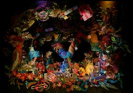
My initial thoughts included aspects of the history of crystal palace within our design, but to also link this back to the contents of the shop. The shop reminded me of a little woodland world in which people are transported somewhere else when walking from the busy high-street. This is therefore something which could be used within our designs, and will lend itself to our style of work. The main rule of thumb when designing window displays, is to have 30% product and 70% prop and this therefore allows us to link both our illustrative work with 3D and then the promotional stock. There are some products which have stuck into my mind, for example the glass photo frames, wooden bowls, handmade soaps and the screen-printed tea towels. Therefore, my first ideas leave a space for these products and how they can work together to create a luxury lifestyle that our audience will desire.

To start the visual process, I have been focusing on dinosaur skin which sounds slightly random, however this is in reflection to dinosaur court which is a series of sculptures of extinct animals commissioned in 1852. These dinosaurs were to celebrate the palace’s move from Hyde park and sat alongside the great exhibition. It is therefore a major aspect of the areas culture as the dinosaurs are a still standing tall and are a hidden treasure of Bromley. I began to use left-over acetate and loosely follow the lines and texture which can be seen on a dinosaur’s skin. This created a linear pattern which appeared like contours on a map, but also related to the organic shapes and ethics of Smash Bang Wallop. I continued this technique on a bird’s eye image of the crystal palace maze, and also on the historic palace itself. White seemed like an obvious choice as I can layer these images and keep them neutral without distraction. However, I have also experimented with using the blues and oranges which are featured in SBW’s logo and on the shop front. A technical aspect which cannot be ignored is the dusky blue window frames and the orange titling, which of course need to be complimented within our final design. Also the windows are the only source of natural light on the ground floor and this is important for the inside displays and the shopping atmosphere. Therefore, the idea of acetate would give light to the space, but also allow for our illustration to be displayed. I was also considering the idea of paper cutting as a way of back drop but also keeping the view of the shop from passersby. This would also give patterned shadows as the light hit the display which could be interesting visually, especially on the blank wall at the back of the shop.

Animation Experiments

As part of the ‘Wake Up Call’ outcome requirements I have to create a 1-3 minute moving image piece which will act as a creative portrayal of my progression throughout this project. As this is something that I have zero experience with, I am starting from scratch and beginning to understand the essence of storyboarding and breaking down an animation into simple frames. I am looking to create a stop motion animation which is where the entire film is created by individual photographs which come to life by elements being physically moved throughout. The key here is to keep the story simple and clean so as the overall clip doesn’t become too confusing to follow. I have started my experiments on iMovie, which I am looking to branch into Adobe After effects as this will enable me to be more precise with the colouring and timings.

My first experiment actually had nothing to do with the themes I am looking to include in the final film, as I just wanted to get to grips with the step by step motion which I need to adopt. What I mean by this is that with stop motion you have to move the object every time you take a photograph and the slower you move these will be the smoother the picture will run. I felt it necessary to try this out before using my illustration as I can then learn through a very simple sequence rather than jumping into the deep end. Unfortunately, I am unable to post the videos onto this blog at the moment for technical reasons, but the first animation had a series of nail varnish bottles entering into the frame. Some turned or messed with the order of the line, which gave me the idea of elements work with but also against each other. I want each object to have their own personality, ones which people warm to and ones which have a dominating character. Furthermore, as the basis of my work has come from photograms, I want to include layering and positive and negative imagery (whether this be literal or metaphorical). This lead me to my second animation of the day, starting to gather materials which I already have and place them together in motion. This includes my drawings and simple rotations and I have even started to draw on sections, but this needs to be slightly more dramatic to increase the impact. These initial experiments have settled my mind as I now know that I am physically able to create some sort of animation to hand in! Now my thoughts need to turn to the storyboard what I actually want to say to the audience. I know that I want there to be an element of typography and maybe speech bubbles as I feel like this needs to be an honest representation of the way which I think and come up with my ideas.

Starting Thoughts On Window Design Project

The new project to start this term is once again a group project involving three dimensional design aspects. For the final term there was a choice of three different briefs, which meant that we could choose the subject which would suit our future interests and style of work ethic. The task is to create at least one shop window display for an outside company which we have to source ourselves and enhance our entrepreneurial skills. This has always been something which has greatly interested me as I love to create something from nothing and advertisement is an area in which I would like to explore in my future career paths. This was also a brief which is group based with a professional collaboration, giving the opportunity to make key contacts within different industries. This is somewhat similar to the QBE reception installation which I completed last term, however this project is something that we need to fight for a little more as the company is not given to us on a plate and we have to consider the type of work we are looking to achieve.

My research started with a little google search to get inspired by the high end window designs in Selfridges and Fortnum and Mason. The examples which follow the search are incredible and go beyond the basics of advertisement, demanding attention from the audience whilst expressing lifestyle ideals. As a group we already decided that we want to work with a book shop as they are often independently run and have a great vintage quality which can be enriched through our illustration. Also from research on how to create a successful window display each article discusses the need for a strong story within the design, and of course this would feed from the stories which the shop owners intend to  promote. It was also interesting to look at tips from bloggers as to how to place elements within a frame. Although we want the overall visual to invite the viewer into a different world, there are strict boundaries space wise which we have to consider. One article said that it is imperative to look at the window display as a blank canvas and to identify where  eye level falls. This is where the main focal point of the display should sit, but should also be considered from the other side of the street. A window display should be bold and dynamic however this needs to be kept simple as a cluttered frame could lead to confusion but also anxiety subconsciously. The image should be balanced and not top heavy as the story should not only be clear, but it should be aesthetically pleasing. All these details are just as important as the illustrative elements, and it was lovely to hear that one shop keeper had created a window display with under £100 as the funds are not something which we are provided with.

Below are some visuals which have inspired my thought processUnknownUnknown-7Unknown-6Unknown-5Unknown-4Unknown-3bookshopUnknown-160d10d18c07f26d7bcf587e86be96296

Thesis Proposal Starting Thoughts

The aim of this next term of theory lessons is to find an area of study which will then become a thesis proposal. A thesis is slightly different to a regular dissertation as although it relies on an independent research base, it asks you for your own personal place within the subject matter. The purpose of the body of work is to create something with a new and interesting angle which is subsequently informed by in depth research. This is therefore more than just relaying the facts and figures which can be found, but to also analyse and present an argument which could well be controversial. 

This is of course a rather daunting task as over the next few weeks I have to come up with a subject matter and question which I am passionate about enough to spend time researching into. My initial thoughts were to try and incorporate my aspirations for the future within my writing, and therefore focus my attention to either interior design or fashion based studies. This could come in the form of the theory of a certain interior design such as the work of Gaudi on space and structure, but also considering pattern work. Although this is something which greatly interests me I cannot see this being condensed into an answerable question. Therefore, I want to touch on the topic of fashion illustration, which I studied briefly in the first year. Although I did actually write a lengthy essay on the deminsihing world of fashion illustration, I only lightly stretched the surface of the issues withing the industry. My main interest is the connection between fashion illustration and body image. It is fair to argue that when you imagine a typical fashion illustration, the figure will have a tiny waist and exaggerated limbs which just do not seem to be in proportion. A campaign by star models, a Brazilian modelling agency, has made this point loud and clear by manipulating their models into a body shape which resembles an original fashion illustration. It is then clear too see that these illustrations promote a disgustingly unhealthy ideal in which when scientifically calculated would mean that a girl would not be able to survive in real life. This seems to be a starting point to my thought process and could lead into discussions regarding why fashion illustration is so unpopular now, but also in relation to Barbie dolls and the traditional ideas of the perfect women. For research purposes I am going to try and get into contact with fashion illustrators and see what their personal views are surrounding this issue, but also look in the university’s extensive Vogue collection to pin point any concerning areas.

brunette_aotw

If any of you have any further ideas, please leave a comment below, anything would be greatly helpful!


http://workthatmatters.blogspot.co.uk/2013/04/humans-dont-look-like-fashion.html