Within my outcome I wanted to take the reader on the same revelation as I had experienced through my research. I have taken issues involving the captivity of Orcas mentioned in Blackfish the documentary film, and created single illustrations to represent each one. I intend to reveal to the reader something new as they turn the pages, something that they didn’t know or expect at the beginning of the book. My publication is therefore going to be image based and minimalist with a large use of negative space. This will allow the reader to just focus on the detailed illustrations and not get distracted by other design work. I was originally going to present this as a children’s book with a character who mimics me as a child, however I felt that the book didn’t need this element and can best tell the story on its own. My publication with also be based around cut outs, where I can restrict and control which illustrations the reader sees on each page. I have designed these cuts outs to be in the shape of the Orca’s markings, also I want the images to change over time as the readers knowledge becomes clearer.
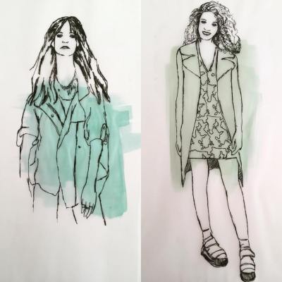
Below is my initial mock up publication, however the final publication will be A3 in size and be on black paper instead of white. Apologies for the pixelated photography, I guess the Iphone camera inst as good as I thought it was!
Screen Printing always seems a little daunting as it is such a long process to transfer your image onto the screen, however this technique of stenciling that I was introduced to yesterday is highly experimental and just great fun! The key is to layer up the images with different colors and stencils starting with the lightest and ending in the darkest/most vivid tones. My work is normally so neat and pristine and I love it when a technique allows me to let go of this control and create something which I am not really sure what the outcome will be. The images above have only got two layers printed on top, however I intend to go back to this resource and print with a definite subject matter in mind, and add as many layers as possible!
Oral history is the collection of historical information from people who witnessed significant events first hand. Oral history can be seen as a living history where people are able to share their personal and emotional accounts. These stories have often been hidden away for many years and can be seen as the best way of gaining a full insight to events we cannot even begin to imagine.
The Imperial War Museum holds powerful examples of oral history in the Holocaust section. The exhibition space is designed to take you on a journey of the Jewish, gypsies, pole and disabled population, exploring the way in which such tragic events occurred. The reason that the exhibition was so moving was due to the way the oral histories were distributed throughout each section. As the audience moves through the time line there are videos of survivors sharing thoughts and personal details which you wouldn’t find in a history book. As a result of this the visitors study the space in silence, listening to the compelling voices in the background. It is fair to say that most people have heard about the Holocaust; however we do not understand the extent of the devastation until we understand it from an eye witness. The element which is most striking about listening to the videos is how normal these people are. They spoke about their happy family lives before the genocide, describing the small things which stick in their memory. It really allows for the visitor to put themselves in survivor’s shoes and understand how they would feel in the same situation. For me personally, it is often difficult to understand how such events came to affect good people; however the details of the first stories allow you to understand how the Nazis started off with small segregations which amounted into the state sponsored persecution.
News of the World Project is a brief which asked us to find a news article and create an end publication in response to the story that we choose. My inspiration came from a documentary film called Blackfish , explaining the animal cruelty of Orca whales in Sea World parks. The film followed the journey of Tilikum who has violently killed three trainers whilst being in captivity and being forced to live in such awful conditions. These deaths have been covered up by Sea world , a company which prides themselves on their caring conservation projects. It is clear that Tilikum has been physiologically damaged as a result of living in confined spaces, violence from other whales, being torn apart from his family, and also being starved if the behaviors were not up to necessary standards. I felt it was important to use this issue as a basis for my project as I myself feel as if I have been lead to believe a lie. I have been to the Sea World parks and have actually had my photograph taken next to Tilikum the whale. I had no idea at the time about the immoral conditions as the trainers are told to bend the truth of the situation so as to convince the public that living like this is healthy for the whales. More shockingly I watched the same ‘Believe’ show in which Dawn Brancheau was tragically killed later that year. This film seemed to struck a nerve inside of me allowing me to place myself in the shoes of the trainers and the Orca itself and I feel as if it is my place to do this story justice and create something which best represents my discovery.
Above is the trailer for Blackfish, the full film is available on Netflix , sky download and also in parts on youtube.
Firstly I began to collect secondary research images which allowed me to realise that these images, whilst shocking to a certain extent, do not resonate in peoples minds. To force people to confront this issue we need to bring it back to home, to something which we can comprehend. Therefore I experimented with transferring the same violence to a human model, where the viewer can better translate the issues.
The first experiment is a self portrait achieved by photocopying my face. This gives the impression that I am restricted and trapped in a confined space. The image is striking as it appears as if i am in pain, but also hopelessly struggling. We would never ignore another human captured, therefore why should the feelings be different if it is an Orca? I also extended this experiment by putting these photocopies into a glass jar.
The second and third images are illustrations that I created in response to the violence that the whales experience in captivity. Young Orcas are taken from their families and placed in the habitat together expected to create new family bonds. However Sea World know full well that Orcas speak different languages according to the family that they left behind. Therefore the Orcas cannot understand one an other and as a result get frustrated and start raking and attacking. The whales have been seen during a show, bleeding in the pool and lashing out at each other, which sea world cover up as them accidentally rough playing. Therefore I wanted to create the equivalent violence on a human as we take issues such as domestic violence so seriously- again, why is the importance different just because it is another species in question.
A family photograph is something that everyone puts value upon as it holds fond memories of loved ones. However they do not portray an accurate representation of the family dynamic as there are accepted social behaviours preventing the photograph displaying anything other than a positive image. For example the image which I have chosen to analyse is a photograph of my mother in the arms of my grandmother as a small child. The image displays typical conventions of how the family want to be portrayed, the maternal and caring nature of the mother. My Grandmother was probably controlling the way she wanted to be seen by the camera, In order to create the “perfect” family photograph. However I know from stories told by my mother that the family was under a lot of stress from my grandfathers Jewish parents has he had married a Christian woman. Therefore the moments before and after the shot was taken could be completely different that the mood presented here, but these stories have been lost in time.
Discussing this with my mother made me realise that as she cannot remember the photograph being taken, and unfortunately there is no one else here to tell the story of the image, that the story behind it can only be told through assumption. Photographs are used for digital accuracy of how a person looks and the scenery surrounding them; however can never capture emotional accuracy.
In reference to who actually has control over the photograph, there are a number of factors stopping the subject from fully owning the way they are portrayed. Historically the woman was in charge of the family photographs; this was supported by Kodak advertisements and also is represented in my chosen image. It is fair to suggest that the photographer has part control as to how the image is lit and composed as they are the one operating the camera and taking the final image. Furthermore if there is more than one member in the photograph you cannot completely control what the others do. Therefore the closest we can have to owning our photograph is through portraits as we only have to worry about the way we look and act in the snapshot. These still encounters a problem however as there is still a photographer present. The recent selfie trend is a modern way of overcoming these problems and allowing full ownership of the photography process. This is a photograph which you take of yourself where you can see the image that you are taking before you fully capture it, therefore deciding the lighting and composition yourself.
Annette Kuhn (1995) Acts of Memory and Imagination New edition William M Murphy
Below is Our final proposal that we sent along with all our research to the client for shortlisting.
Our idea is to create a sphere around 1.5 metres in height, made of clear acrylic. This will represent ‘the world’ of QBE, this will then encase 38 smaller spheres, each one representing a country in which QBE has offices. Each of the smaller spheres will then contain an air plant.
The reason that we wanted to work with plants is because of their growth, this will echo the growth of QBE as a large company, an element that we were keen to include in our piece. We also feel that the organic shape of the piece and the plants will juxtapose the straight lines and interior of the new foyer perfectly.
This was also some of the visuals that we sent to the client, including how we would imagine the instillation to fit into the space itself. We are imagining the whole sphere to be on the floor where the viewer can see the object from all sides.
Found below is some of the visual inspiration behind the main idea we are proposing for the art installation into the new QBE reception foyer. The mood boards which the client gave us was really helpful in designing something which would not only be a conversation starter for users of the space, but would also become part of the whole experience. As you can see we were particularly struck by lighting elements, natural forms, and organic shapes. Another point of inspiration for us was the Remembrance Poppy installation at the Tower of London. This was something which captured the nation and brought together small individual items together as a whole.
I also visited 100% Design in the summer break from University which also sparked ideas which contributed to our final proposal. This design exhibition was particularly helpful when thinking about high end and bespoke design as it featured designers who worked in similar ways to a fine artist-using concepts to drive forward the visuals. The geometric and organic shapes presented in harmony was something that seemed to be a trend throughout the displays.
Starting our collaboration project was somewhat daunting as this was a new opportunity which was somewhat out of our comfort zone. We decided as a group to brainstorm separately to begin with and then join our ideas together when we met. I started off looking at what I knew that the company wanted from the final design. The final structure needed to be modern and dynamic, representative of the company and include references to the growth of QBE as an international company. The main idea which we came up with very quickly after was to have a glass spheres with air plants contained within. Air plants are a rather peculiar type of plant which can survive from very little water and no soil what so ever-and so are perfect for an office environment. The idea was to have 38 air plants to represent each country which QBE operates within. The fact that the clients and staff of QBE could watch the plants evolve over time would also add an interactive element which is key to the success of an art installation. The presence of nature will also show the bond between the countries and the way that QBE can work as one company across waters. It was then my ideas to contain these smaller spheres into one giant glass sphere which would then encapsulate the smaller forms.
Please see below our initial brain storms and sketches visualizing our ideas.
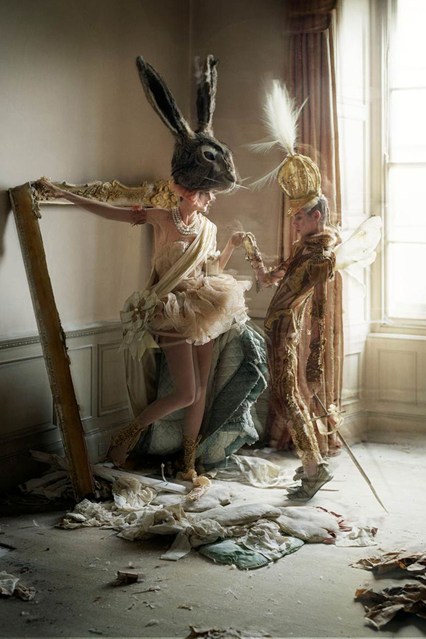
This photograph is an image in an editorial called Lady Grey by Tim Walker for Italian Vogue. The imagery combines elements from Alice in Wonderland and Marie Antoinette’s biopic to create a nostalgic atmosphere. Tim walker is able to create a dream world which is so effortless that the viewer begins to believe the scene they see. The thing which really compels me towards this image is the fact that normally imagery with this amount of fantasy elements can look too over the top and garish, but this theme is subtle and flowing without forcing the character upon people. Moreover the stereotypical Alice in Wonderland image has natural settings, but in comparison, this image has a man made background with organic shapes created by the mess on the flooring. It is almost like the characters from the story have been brought into our world, rather than Alice entering into theirs. The frame is dramatically composed as the figures are present in the middle of the borders. Furthermore there is strong backlighting which highlights the uncanny figures and headpieces allowing the viewer to notice all the details of the narrative. There is also a strong used of negative space between the models and the shapes that they create are almost awkward, contributing to the surreal nature of the high fashion imagery. The fact that the characters are not acknowledging the camera allows us as the viewer to become a fly on the wall observing the way that they interact together. Additionally the scene seems to grow beyond what we can immediately see. We imagine an empty room where the characters have just stumbled upon each other for the first time.


 A family photograph is something that everyone puts value upon as it holds fond memories of loved ones. However they do not portray an accurate representation of the family dynamic as there are accepted social behaviours preventing the photograph displaying anything other than a positive image. For example the image which I have chosen to analyse is a photograph of my mother in the arms of my grandmother as a small child. The image displays typical conventions of how the family want to be portrayed, the maternal and caring nature of the mother. My Grandmother was probably controlling the way she wanted to be seen by the camera, In order to create the “perfect” family photograph. However I know from stories told by my mother that the family was under a lot of stress from my grandfathers Jewish parents has he had married a Christian woman. Therefore the moments before and after the shot was taken could be completely different that the mood presented here, but these stories have been lost in time.


 This photograph is an image in an editorial called Lady Grey by Tim Walker for Italian Vogue. The imagery combines elements from Alice in Wonderland and Marie Antoinette’s biopic to create a nostalgic atmosphere. Tim walker is able to create a dream world which is so effortless that the viewer begins to believe the scene they see. The thing which really compels me towards this image is the fact that normally imagery with this amount of fantasy elements can look too over the top and garish, but this theme is subtle and flowing without forcing the character upon people. Moreover the stereotypical Alice in Wonderland image has natural settings, but in comparison, this image has a man made background with organic shapes created by the mess on the flooring. It is almost like the characters from the story have been brought into our world, rather than Alice entering into theirs. The frame is dramatically composed as the figures are present in the middle of the borders. Furthermore there is strong backlighting which highlights the uncanny figures and headpieces allowing the viewer to notice all the details of the narrative. There is also a strong used of negative space between the models and the shapes that they create are almost awkward, contributing to the surreal nature of the high fashion imagery. The fact that the characters are not acknowledging the camera allows us as the viewer to become a fly on the wall observing the way that they interact together. Additionally the scene seems to grow beyond what we can immediately see. We imagine an empty room where the characters have just stumbled upon each other for the first time.